The Magazine Spread as a Sequence, Not a Stack of Pictures
Read a fashion magazine spread as a sequence: notice how page order, visual pauses and recurring details shape the story without a caption.
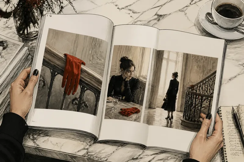
A reader turns a fashion magazine page and stops at a photograph of a red glove resting on a stair rail. The next image is wider, the model farther away; the glove appears again, now barely visible. A fashion magazine spread is often read this way: not as a pile of pictures, but as a sequence whose order gives each image a job.
That sequence can be quiet. A change in scale, a patch of empty paper or a repeated detail may be enough to move the eye from arrival to pause to departure. These are useful things to notice whether you are reading an editorial for pleasure or considering how its pages have been assembled.
Page order gives images different jobs
The opening image establishes the editorial’s visual territory. It may introduce a face, a location, a silhouette or a colour that will matter later. It need not explain the whole story; a strong opening can leave a small question hanging.
Following pages can answer that question, complicate it or set it aside. A close portrait after a distant figure makes the body feel newly present. A second image from the same room may instead make the setting feel like the subject. The change between pictures is part of the editorial’s meaning.
Look at the spread as a reader encounters it: left page, then right, then the turn. A photograph that seems slight on its own may work as a bridge between two stronger images. The page turn also withholds what comes next, giving the sequence a modest bit of suspense without requiring a plot.
Visual pauses are made from space and restraint
A pause does not have to be a blank page. It might be a small image surrounded by generous white space, a quiet portrait after a crowded composition, or a page with very little copy. The eye has fewer competing demands, so the image can hold attention for longer.
White space is not automatically calm. A narrow margin around a face can feel tighter than a page filled with open sky. Likewise, a small image placed far from the gutter may seem deliberately isolated. Notice how the size and position of an image affect its relationship to the paper around it.
Captions, credits and headlines alter that space too. A title placed across an otherwise open field can interrupt the pause; a caption tucked near the edge may leave the photograph’s main area undisturbed. Neither choice is inherently better. The question is whether the words join the image’s rhythm or compete with it.
Recurring details can act as quiet markers
A repeated detail helps a reader recognise continuity without spelling it out. It might be the same glove, a strip of striped fabric, a particular chair or a consistent colour appearing in different settings. Repetition invites comparison: has the object moved, changed, or become less important?
For a simple reading exercise, imagine a fictional editorial that opens with a model holding a red glove beside a stair rail. The next photograph shows the model seated at a table, with the glove folded near a glass; later, the model leaves the room and the glove remains on the rail. The detail first introduces a colour, then becomes part of the scene, then marks an absence. Nothing in that invented sequence proves a single intended story, but it gives the reader something concrete to follow.
Recurring details need not be objects. A repeated pose, a line of architecture or a similar crop can create a visual refrain. If a detail appears only once, it may be incidental; if it returns with a noticeable change, it can become a cue. The useful habit is to ask what has altered, not merely to spot what is repeated.
How should a reader follow a fashion spread?
Should I look at the pictures before reading the captions?
Try a first pass without captions, then return to the text. The first reading lets you notice order, scale and repeated forms before words steer your interpretation.
What should I notice at a page turn?
Compare the image before the turn with the first image after it. A shift in distance, setting, gesture or colour can signal a new section, while a visual echo can carry the earlier mood forward.
How can I tell whether an image is a pause?
Look for reduced visual activity: more open paper, a simpler composition or a quieter gesture. Then check what follows, since a pause often changes how the next, busier image feels.
Do repeated details always have a symbolic meaning?
No. Repetition may simply help the pages feel related, and not every glove or chair needs an elaborate interpretation. Treat a possible meaning as a reading to test against the rest of the sequence, not a hidden answer.
Read the spread in passes
A compact method keeps attention on the editorial rather than on guesswork:
- Trace the order. Note where the sequence begins, where it changes direction and which image appears to close it.
- Compare scale. Mark when the camera moves from a full figure to a face, garment detail or environmental view.
- Notice the pauses. Look for open paper, restrained compositions and pages carrying little text.
- Follow one recurring detail. Record where it returns and whether its position, prominence or context changes.
- Read the copy afterwards. See whether the headline and captions sharpen, redirect or simply accompany the impression formed from the images.
These notes do not need to become a verdict. A reader can hold two interpretations at once: the glove may connect the pictures, while the changing distance between model and camera gives the stronger sense of movement. The point is to notice what the pages actually offer before deciding what they mean.
Sequence is more than chronology
Magazine order does not have to mimic events unfolding in time. A photograph of a room can follow one made outside; a detail can appear after the full look it belongs to. That arrangement may be organised by colour, shape or mood rather than by a literal account of what happened first.
This is why a spread rewards a second look. Once the last page is reached, the opening image may appear different: a detail that seemed incidental can now feel like a signal, or a bold opener can read as an invitation rather than a summary. The reader brings later pages back to earlier ones in memory.
Next time you open a fashion editorial, follow one feature across the paper before settling on a story. Page order, visual pauses and returning details are not decoration around the pictures; they are part of how a magazine spread speaks. The pages may still leave things unresolved, which is often a more interesting ending than an answer in a caption.