The Myth of the Instant Fashion Image
The instant fashion image is assembled through cropping, sequence and caption choices; see how careful edits preserve context and shape a post’s meaning.
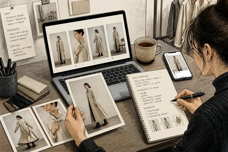
A phone buzzes beside a cup of tea: a fashion image has just appeared on a brand’s account, complete with a sharp crop and a caption about the coat. It looks immediate. The instant fashion image, though, is usually the visible end of decisions made before anyone taps “share”: which frame to use, what to cut away, what should come before it and how much the words should explain.
Those choices do more than tidy a post. They decide whether a viewer sees the garment as an object, a styled look, a moving body or a fragment of an aesthetic. The walk-through below follows one invented situation from a folder of photographs to a finished post, keeping the focus on three editorial decisions: cropping, sequencing and captioning.
The source image contains more than the post can show
Imagine a small fashion label preparing a digital post for a new wool coat. Its photographer has supplied several frames from the same short shoot: a full-length image against a pale wall, a closer view of the coat’s fastening, and a frame in which the model is turning towards the exit. A fourth photograph catches the coat over a chair while the model adjusts a sleeve. None is inherently the correct choice. Each makes a different claim about what matters.
The label’s editor begins by writing down the post’s actual purpose: show the coat’s shape and construction, while making clear that it is worn rather than presented as a product cut-out. That small decision narrows the field. A detail shot could make the fastening legible, but it would not show the silhouette; the chair photograph has atmosphere, but the garment is not being worn. The full-length frame and the turning frame remain candidates.
This is an editorial brief, not a slogan. “Make it feel striking” is too vague to settle a crop or caption. A useful brief names the evidence the viewer should be able to see: the coat’s length, the way its collar sits, or how its fabric moves. It also leaves room for an image to retain something less literal, such as a gesture or a pause, rather than treating every photograph as a diagram.
The editor checks the supplied images at their intended display size as well as on a larger screen. At a reduced size, the fastening may disappear, a sleeve may merge with the background, and the turning pose may read as a blur. These are not defects in the photographs; they are changes in what the platform’s format makes prominent. Looking at the frame in context helps distinguish a genuine visual problem from a detail that simply cannot survive a small display.
Cropping changes the evidence in the frame
The full-length photograph is made in a vertical frame, but the social post will also be viewed in a square preview. If the editor crops tightly around the coat, the hem and some of the model’s lower body vanish. The garment may then appear shorter and more box-like than it does in the uncropped frame. If the editor leaves too much empty wall, the coat becomes a small object in a pale field. Neither adjustment is neutral.
The editor makes a version that preserves the coat from collar to hem and keeps enough of the model’s posture to show how it hangs. The hand near the fastening remains visible, because it gives the viewer a sense of scale and draws attention to the closure. A strip of wall is sacrificed, but the shoulder is not cut off simply to make the coat fill the thumbnail.
One practical way to judge a crop is to ask what the lost edges were doing. Were they showing the garment’s length, a hand in relation to a pocket, a floor that clarifies where the model is standing, or only unused space? Then ask what the new edges imply. A crop that ends at a joint can look abrupt; one that removes the face may make the post feel more like a product image, even if the original photograph was about a person wearing clothes.
For the turning frame, the editor preserves the direction of movement by leaving room in front of the model rather than trimming the figure against the edge. That open space is not decorative padding: it lets the pose read as a turn towards somewhere. The coat’s skirt also has room to swing. Cropping away the space ahead of the model would make the same body position feel more cramped and less purposeful.
The label’s editor keeps the uncropped original and makes a separate crop for each placement, instead of repeatedly trimming an already reduced export. This keeps the available image information intact and allows a square preview, a vertical feed post and a story layout to make different compromises. The files are labelled by placement, so the version intended for a tall screen does not quietly become the source for every other format.
Sequence gives separate photographs a relationship
The editor now has two leading images: the full-length coat portrait and the turning frame. Posted alone, either can carry the message. Together, they create a small sequence, and the order affects what the viewer notices first. Beginning with the turn offers movement and intrigue; beginning with the full-length view gives a clear account of the coat before the detail arrives.
For this post, the full-length image comes first. It answers the basic visual question quickly: what does the coat look like on a person? The turning frame follows, adding a sense of movement and revealing how the fabric behaves when the model changes direction. The detail photograph of the fastening comes third, where it can reward a viewer who chooses to continue swiping without having to carry the entire story by itself.
That order also avoids making the close-up look like the whole product. A fastening can be handsome and still be a poor opening image if the post is meant to introduce the coat as a complete garment. Conversely, a detail might deserve the lead if the rest of the post is clearly organised around construction. The sensible order depends on what the images can show, not on a universal rule that portraits must always come first.
Before publishing, the editor previews the images in the order a reader will encounter them. In the full sequence, the second frame looks too similar in tone to the first, so the coat’s outline becomes less distinct as the viewer swipes. The editor chooses the other turning frame, where the background is darker behind the pale sleeve. This is a sequence decision based on the relationship between adjacent images, not a claim that the darker frame is better in isolation.
Sequence can also change the status of a frame. A photograph of the coat over the chair might feel like a deliberate pause after the worn portraits, or it might interrupt a post that is trying to explain fit. Here the editor leaves it out. The omission is not a judgement on the photograph; it reflects the post’s limited job. A different post, with a focus on the garment’s handling between looks, could make that chair image the point rather than an aside.
A caption should clarify without overruling the photograph
The first draft reads, “A new kind of classic. Made to turn heads.” It could accompany almost any coat, and it tells the viewer nothing about the fastening they can see. The editor replaces it with a plain description of the wool coat and its visible feature, then adds the label’s product name if that name is used consistently elsewhere. The words identify the garment without pretending that the photograph proves claims about warmth, origin or durability.
Captions can supply information an image cannot carry: a designer’s name, the garment’s title, the person pictured, or a distinction between a campaign image and a product photograph. They can also direct attention. “Look at the fastening” is blunt but useful if that detail matters; “the coat in motion” makes a different promise. A caption that calls a garment oversized when the crop hides its proportions may create a mismatch rather than resolve one.
The editor checks the words against the visible frame. The image shows a model wearing a coat; it does not show how the fabric feels, how it performs in rain, or who made every component. Those details belong only if the label has reliable information for them and a reason to include it. Otherwise, the caption can stay specific to what is present and name the product without adding a cloud of persuasive adjectives.
Alt text has a separate job from the social caption. It should describe the image’s useful visual information for someone who may not see it, rather than repeat promotional copy. For the lead image, a concise description might identify a model wearing a long, pale wool coat against a plain wall, with one hand near the fastening. The label should adjust that wording to the actual image and its context; if the person’s identity is known and relevant, it can be included accurately.
The editor also checks where the caption will break on a phone screen. If the first visible words are only a slogan, the product detail may sit below an invitation to expand the text. The opening line therefore names the coat and its feature, while supplementary information follows. It is a modest layout decision, but a viewer should not have to open a caption merely to learn what the post is showing.
Editorial decisions make an image feel immediate
In the invented situation, the post is assembled from existing photographs, not created by pressing a button at the moment of publication. The editor has selected a lead frame, preserved the coat’s length in a crop, ordered the turning image after the full view, and written a caption that names what is visible. Each choice narrows the range of possible readings. Together, they make the post look settled enough to feel instant.
That does not mean every fashion image needs a long approval chain or a solemn explanation. A small post can remain quick and loose. The useful distinction is between speed and absence of editing: a fast decision is still a decision, and a platform’s default crop is still a crop. Recognising that gives an editor a chance to notice when a default is quietly changing the image’s meaning.
For a final pass, the label checks the post as a reader would encounter it: preview first, swipe through the remaining frames, read the caption as displayed, and confirm that each image has an appropriate description where the platform supports one. The purpose is not to polish away every irregularity. A stray fold or a slightly uneven turn can help an image feel inhabited; the question is whether it belongs to the intended picture or distracts from it.
Questions about editing a fashion image for a post?
Should the original photograph be cropped to fit every platform?
Usually, it is clearer to retain the original and make a separate crop for each placement. A square preview and a tall story frame give different amounts of space to the body and garment, so one export may not preserve the same useful details in both.
Should a fashion post lead with a full look or a close-up?
Use the frame that best answers the post’s main visual question. A full look gives context for silhouette and styling, while a close-up can lead when a specific construction detail is the subject rather than a supporting point.
What belongs in a fashion image caption?
Include information that helps identify or understand the image, such as the garment’s name, the person pictured where relevant, or a visible design detail. Keep claims about materials, origin or performance to information the label can substantiate.
How should alt text differ from a caption?
A caption can name the product and provide editorial context; alt text describes the visual content for someone who may not see the image. They can share a useful detail, but copying a slogan into both fields serves neither purpose particularly well.
The instant fashion image is easier to read when its making is not mistaken for a neutral upload. A crop decides what remains visible, a sequence decides what arrives first, and a caption decides which facts travel with the frame. Before tapping “share”, the most useful last question is simple: does the post let the viewer see the garment the way the editor intends, without asking the image or its words to claim more than they can show?